One Iteration of Right, Part II: The Rebuild
The friendly third version was better than the first two. It still hid the reason to build a visual editor: comparing several lights on the same brightness axis.
This is the second half of a build session for Lightener Studio, a Home Assistant editor for the brightness curves that drive individual room lights.
The Unanimous Verdict
All three models reached the same conclusion: the prototype inverted the information architecture of the original proposal.
The proposal's value was visual comparison of brightness curves across lights. The prototype showed one curve at a time.
I had focused on making single-curve editing feel good and lost sight of the comparison that made visual editing worth building.
Where All Three Agreed
| Finding | Opus | GPT 5.4 | Gemini |
|---|---|---|---|
| Overlaid multi-curve graph is missing: the single most critical gap | ✓ | ✓ | ✓ |
| Save/Cancel workflow and dirty-state indicator absent | ✓ | ✓ | ✓ |
| Room tabs are the wrong abstraction for a per-device card | ✓ | ✓ | ✓ |
| Brightness slider is useful for demo but wrong as centerpiece | ✓ | ✓ | ✓ |
| Graph lacks axis labels, grid lines, and is too short | ✓ | ✓ | ✓ |
| Basic curve editing mechanics work correctly | ✓ | ✓ | ✓ |
Where They Disagreed
| Topic | Opus | GPT 5.4 | Gemini |
|---|---|---|---|
| Keep the brightness preview? | Optional card config | Optional scrubber at bottom | Remove entirely |
| How to handle point addition? | Distance-to-curve check | Tap-on-line + inspector UI | General refinement |
| Lit migration timing | Start scaffold now | Prototype more in React first | Jump directly to Lit |
The Unique Discoveries
Claude Opus found a real interaction bug. onUp set drag=null, then onClick created a ghost control point at the release position.
It was a click-after-drag race condition that could have shipped to production.
GPT 5.4 named the hardest UX problem. In an overlaid graph, one tap can select a curve, select a point, drag, add a point, or toggle a legend.
Showing one curve hid that ambiguity instead of solving it. It was also why the architecture was wrong.
Gemini noted that the per-light color coding was wasted. I had designed it for comparison, but the layout made comparison impossible.
Across the three reviews, the prototype earned a B- as a visual concept and a D+ as an implementation of the spec.
Deep Research: Prior Art
Before rebuilding, I read three Home Assistant Lovelace implementations for their input-handling code.
mini-graph-card uses an SVG mask for multiple series. Z-order follows array index. Hover dims inactive series to zero opacity.
Legend click opens the entity's more-info dialog. It does not toggle visibility and it has no touch events.
climate-scheduler uses canvas-rendered diamonds with manual Euclidean hit testing at a 20px radius.
Its gesture thresholds are 5px for drag detection, 300ms for double tap, and 600ms for long press. There is a known race between long press and drag. Mobile editing is documented as broken.
apexcharts-card delegates interaction to ApexCharts.js. There are no custom mouse or touch handlers on the canvas.
Legend toggle and hover dimming are built in. The critical Lit pattern is to create the ApexCharts instance after requestAnimationFrame and updateComplete, never inside render().
Patterns I reused
I kept every curve visible but made only the selected light interactive. That resolves the hit-testing ambiguity in GPT 5.4's five-gesture problem.
setPointerCapture() replaced document-level listeners. Transparent circles behind the 8px dots created 44px touch targets, and a stored grab offset stopped a point from jumping to the pointer's center.
I tested those choices in a set of small research mockups before applying them to the final editor.
The Rebuild
I rebuilt the prototype from scratch using the review and the source-code patterns.
All four curves now share one graph. I render the selected curve last in the SVG, so it stays on top. A legend selects lights and controls visibility.
Only the active curve accepts dragging. Save and Cancel return with a dirty indicator, and a shared crosshair shows every light at one group brightness.
A wasDragging ref guard with a 50ms timeout fixes the click-after-drag bug that Opus found.
The rebuilt prototype is interactive. Select a light, reshape its curve, and inspect the resulting comparison directly.
I removed the room tabs and the oversized slider. The graph now gives the comparison the article set out to make.
The prototype is a single React artifact, so I verified the design by dragging a point into a zigzag and checking that the clamping held.
The crude artifact grew into Lightener Studio, a HACS integration with the editor as a real Lovelace card.
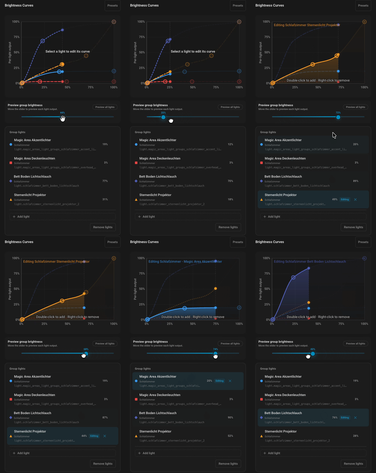
The live demo runs in the browser. You can drag the curves yourself with no install.
The first version implemented the issue and left me with a harder editor. Three fast failures made the missing comparison obvious.
The independent review mattered because I had stared at single-curve editing for too long. The agreement matrix stopped me from dismissing the criticism as one model's preference.
Source code supplied the details that broad best-practices posts leave out: SVG masks, a 20px Euclidean hit radius, and the timing around requestAnimationFrame.
The friendly version with glowing bulbs felt better than the feature-complete version. People adjust a room by watching the lights respond. The graph supports that judgment.