Three Iterations of Wrong, Part I: The Prototype
A typo-filled prompt produced a polished Home Assistant prototype in minutes. Three wrong directions and an independent review got the editor back on the actual problem.
"go cereate a visuall interactive mvp for my proposal jere"
That is the prompt I sent Claude, typos and all.
It led to polished versions of the wrong product. I optimized for features, then simplicity, then friendliness.
The work drifted from the real problem: editing brightness curves without a pile of mental arithmetic.
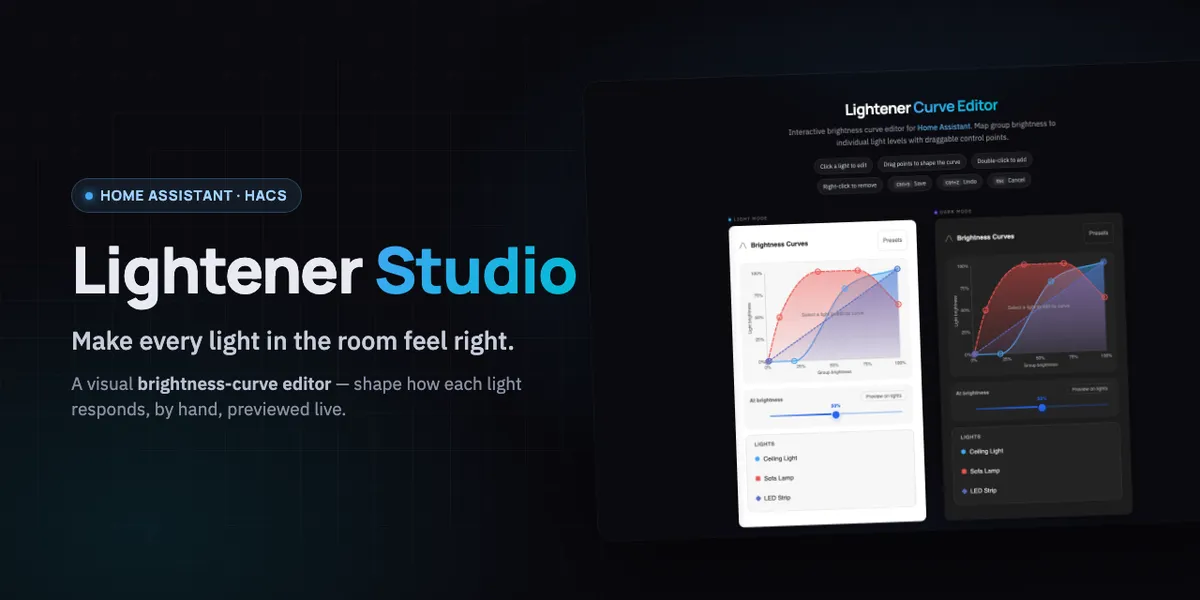
I'd been staring at Lightener's brightness curve config for weeks.
The Home Assistant integration maps group brightness to individual light brightness with piecewise-linear control points.
40:60 means: when the group is at 40%, set this light to 60%.
The configuration works but leaves you editing blind. You cannot see the curves, compare lights, or understand interpolation until you test real hardware at 11pm, when you are trying to sleep.
So I wrote a proposal for a visual curve editor: drag control points on a graph, see all the lights at once, done.
I expected it to take a weekend to specify and a month to build.
Iteration 1: The Kitchen Sink
The first MVP landed in under a minute.
It had the issue's full feature list: draggable points, multi-light overlays, visibility toggles, touch targets, a points table, save and cancel, config output, a status bar, labels, and grid lines.
It was a faithful, complete implementation of everything I had described.
It was as complex as the text config it was meant to replace, a wall of UI that demanded the same mental effort as writing 40:60 by hand.
"too complex. thats just as complex as doing all that in text form"
A spec can describe what an editor does. The prototype has to show why someone would use it instead of the text field.
Iteration 2: Strip It Down
I removed the toggle pills, points table, action bar, labels, and visibility system.
What remained was three light tabs, one clean chart with draggable dots, one brightness slider, and one config line.
The new version was cleaner and still looked too technical.
"still looks too techy"
The chart-with-axes-and-grids framing still screamed "developer tool."
A person opening this on a tablet dashboard would meet a graph before they met their lights. That is a bad opening for bedroom lighting.
Iteration 3: The Friendly Version
I stopped starting with the chart. A person opening a lighting card expects to see their lights.
The redesign put glowing bulbs front and center. Move room brightness and watch the bulbs light up or dim.
Tap a bulb and its curve appears below: small, ambient, almost decorative until you need it.
The config string, 60:55 · 100:100, moved to muted 10px text at the bottom. Power users could find it; everyone else could ignore it.
"this is the one."
Grounding It in Real Data
I asked: "show me how that would look if applied to my real world HA setup."
Claude pulled my actual Lightener configuration from Home Assistant through MCP: Schlafzimmer with four lights and Kleiderschrank with four light groups.
The prototype used real entity IDs, names, and control points.
The demo placeholders became Tree Lamp (#f0b866), Bett Boden (#c084fc), Fußleiste (#fb923c), and Sternenlicht (#60a5fa) with their actual MDI icons.
"Specimen A" responding to a slider tells you little. Sternenlicht glowing blue at 40% because you shaped that curve makes the consequence visible in your own room.
The real names and curves turned a generic mockup into something I could judge.
The Model Council
Before committing to this direction, I sent the prototype to Claude Opus 4.6, GPT 5.4, and Gemini 3.1 Pro for independent review.
Each reviewed the component against the issue spec, prior art, and code quality. Each received the same context. None saw the others' responses.
Their independent verdict changed what I built next.